16 April 2010
Sanity Check On Global Warming Numbers
As I have explained in several of my last few blogs, I have been looking more closely at the detail of the case for global warming. I have analysed global average temperatures as provided by NASA that uses information from the Hadley Centre in the UK and several other sources, as well as looking at fact sheets from the IPCC. My initial take on the numbers is that the media and the politicians may be overstating the historical case and that global temperature rises exist but may be lower than the PR spin.
Before I decided that that was my final conclusion, I wanted to do a sanity check of the global mean figures against some raw data for different regions around the world. These are not intended to be definitive but rather to see whether the trend from the global mean data was matched by a variety of on-the-ground raw data from temperature stations.
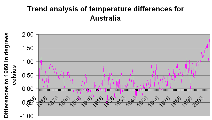
The raw temperature data that I have chosen is for England, the Antarctic and Australia. I thought that would give a pretty good cross-section of temperature profiles. The quality of data varies for each of these, from very detailed as in England which goes back many hundreds of years and uses 3 data points across England, while for Australia and the Antarctic I had to chose a few places that I felt covered sufficient area but also had data that went back at least 100 years, which was supplemented with a few that went back 50 years.
The raw data is available from the following sources, should you wish to do it yourself. Now it is important to state here that the answer is not intended to be complete or definitive, which they are clearly not, but rather they are utilised to show trends and whether those trends fall within the ranges anticipated from the IPCC work and the dataset that I analysed from NASA.
The data analysed from the above gave the following results:
- England temperatures - temperature increase per 100 years = base rise of +0.9oC, with minimum rise of +0.6oC and maximum rise of +1.8oC; the UK Metereologic data series can be seen in full detail at http://hadobs.metoffice.com/hadcet/;
- Antarctic temperatures - temperature increase per 100 years = base rise of +1.1oC, with minimum rise of +0.4oC and maximum rise of +5.3oC;
- Australian temperatures - temperature increase per 100 years = base rise of +1.0oC, with minimum rise of +0.3oC and maximum rise of +2.4oC. If you look at the Australian Detailed Meteorological Office set of detailed anomalies graph it comes with the same answer of +1.06oC and can be found at http://www.bom.gov.au/cgi-bin/climate/change/timeseries.cgi
These results indicate that across a wide range of the world the global warming temperature rises are in line with the averages I previously calculated based on the global mean temperatures.
It is interesting also to note that the figures seem higher than the averages calculated by climate scientists for their global mean averages which suggests that as I would have added extra data points and more accuracy, the mean averages would tend towards a tighter fit line about 0.5oC lower. Also, Antarctic figures were higher than for England, which is in line with what the climate scientists say, ie that the poles will experience the changes more greatly.
Plus ça change, plus c'est la même chose.
The base sources I used can be found as follows:
- England temperatures - http://hadobs.metoffice.com/hadcet/data/download.html
- Antarctic temperatures - http://www.antarctica.ac.uk/met/READER/
- Australian temperatures -http://www.bom.gov.au/climate/
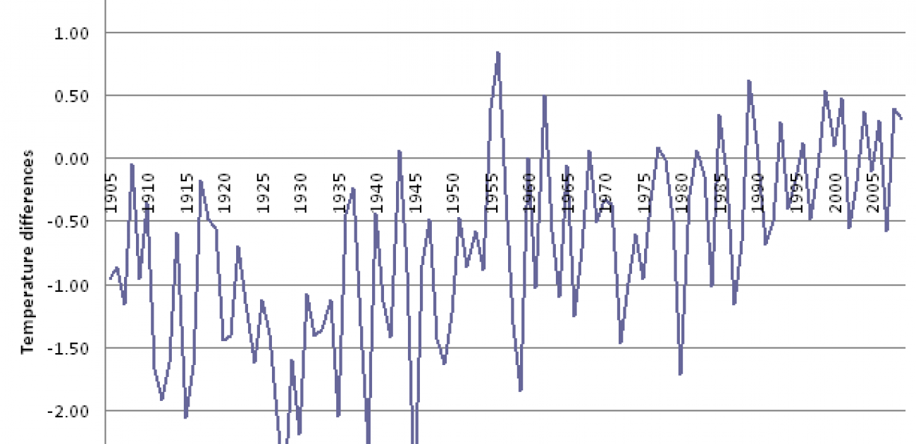
My graphs are as below: